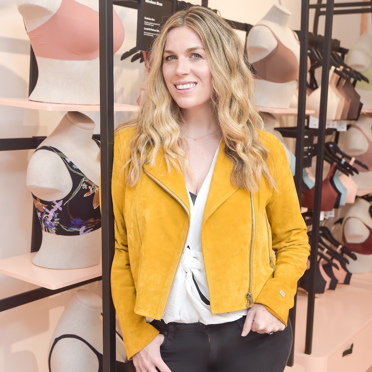
How to Develop Visual Branding for Your Business

Lunapads, founded nearly three decades ago in Vancouver, was a Canadian pioneer in the realm of washable cloth menstrual pads. But in early 2020, co-founder and CEO Suzanne Siemens started to feel like the branding was getting stale—they’d grown beyond pinks and purples. Dovetailing with its product expansion into menstrual cups, the company got a new name (Aisle) and a full-blown aesthetic overhaul. “We recognized that we—and the entire period-care industry—were ripe for a change,” Siemens says.
The decision to rebrand was two years in the making. Though Aisle has always taken pains to not refer to its wheelhouse as “feminine hygiene” for gender-inclusivity reasons, the brand still looked gendered—it used a lot of bright fabrics with patterns like polka dots—which was detracting from its unique product sells like sustainability. (The company has been B-Corp certified since 2012.)
To execute Aisle’s vision of a brand that is ethical for both people and the planet, Siemens brought on the branding agency Feelings Group, whose past clients include the specialty vibrator purveyor Dame. Siemens says the boutique agency really understood the Aisle brand and the period industry as a whole.

In addition to having hours-long conversations about company values and competitors, Siemens says, her team went through aspirational customer profile exercises to get as specific as possible about who their target demo is. Colours and taglines came later, as did rigorous consumer testing. For the latter, they tapped activists and people of colour—groups who aren’t always seen and listened to by businesses, says Siemens. “You need to know what you stand for and be as clear and consistent in your messaging as possible.”
Amid the changes, Siemens wanted to ensure that the history of the brand was not lost. As Lunapads, the company was supporting menstrual-equity projects as early as 2001. It issued a statement on gender inclusion in the period space in 2011 and launched its first boxer brief, with transmasculine customers in mind, in 2016. “We care deeply about our fundamental values around intersectional feminism, sustainability and inclusion—all of which are very clear in our branding today,” Siemens says.

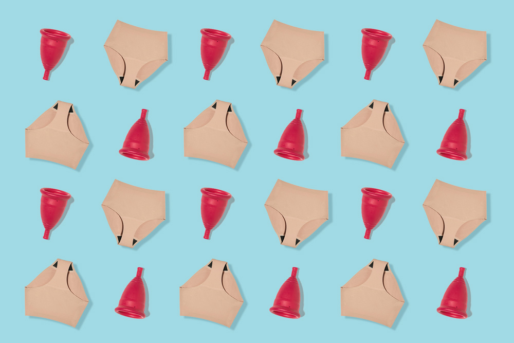
Ultimately, Aisle adopted a genderneutral palette of burgundies, forest greens and mustards. Motifs dotting the perimeter of the packaging are soft to reflect the fluidity of gender. And there is a grand total of zero butterflies and flowers.
When it comes to casting models for its campaigns, Siemens says the body type Aisle prefers is “all,” and its photographs steer clear of Victoria’s Secret-esque posturing in favour of relaxed poses and friendly smiles. Reusables can be intimidating, Siemens says, because they require a shift in behaviour. “But when you see people who look like you wearing and using these products, it can feel much more accessible.”
A couple of years in, Siemens is thrilled to see her rebrand resonating with customers: In the 12 months that followed, Aisle’s period underwear experienced a 60 per cent jump in sales. Among her big takeaways? First, that undertaking a rebrand requires a substantial amount of time and money to do it right. Second, that a consumer brand should always be evolving. “My journey toward understanding period culture has taken 20 years, and I’m still learning,” she says. “We need to be constantly tweaking; branding is a never-ending review.”